
Huge thanks to everyone who voted so far! We started with thirty incredible covers and asked you to vote for the finalists. Now we’ve whittled those down to a final ten. It’s time to decide on the overall best cover of 2017!
You have until Thursday Dec 14th 5pm EST to cast your votes. The winner will receive a badge and a Kobo eReader.
Scroll all the way down to the bottom to cast your vote!

“As this was the last House of Crimson & Clover book, I agonized over the cover for months before I even started writing it. But when I found this particular fractal, and began to play with the way the light both drew you in and drew you past it, as if it went on into the abyss, I realized it was perfect. Though the series is ending, there are more stories and series coming from the universe of Crimson & Clover, and I was thrilled with how this cover conveyed both the satisfaction of an end and a promise of a beginning.”—Sarah M. Cradit

“Jasmine Sea is about finding the courage to face the past in order to move forward. My cover designer and I wanted to show the fragility of happiness and how our past sometimes controls us. The cover represents this so perfectly: a background with a looming storm, and strings holding the sun, clouds and origami boat—Jasmine Sea is a yacht. Look closely to see the boat is made of the parchment from its prequel, The Stationmaster’s Cottage. The red ribbon is also from the prequel. One jasmine flower reminds that this is a love story as well as suspense.” —Phillipa Nefri Clark

Ruthless King, by Meghan March

“I commissioned Damonza to create the cover for The Nazi’s Engineer, giving them little more than, “Maybe a train with a swastika, and some guys rappelling from a Black Hawk.” Just a few days later, I was sent some drafts, and immediately fell in love with this one. It blows me away how good these people are at what they do, and I’m certain they are as humbled as I am to have this work of art reach the final top ten. Good luck to everyone!” —J. Robert Kennedy

“I created the idea for the cover based on the first chapter of Gone Daddy Gone—a college-age girl walking through a peaceful, snow-filled park. She’s all alone, unaware she’s being followed, oblivious of the life-changing events that are about to unfold. Indie Designz took the concept from there and did a magnificent job bringing the vision in my mind to life.” —Cheryl Bradshaw

“The Royals series went through what seems like a hundred iterations before we settled on the watercolor background and the single object in the foreground. Our cover designer is good friend and amazing author, Meljean Brook. We took that friendship to the limits. Over a hundred emails and three different concepts later, we settled on this now iconic cover design and fonts. We never realized how important font and typography is for a cover before this. We couldn’t have done it without Meljean. Check out her books! She’s as great of a writer as she is a cover designer.” —Erin Watt
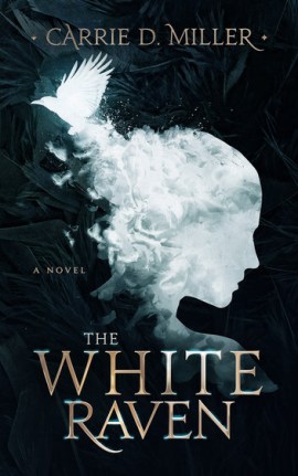
“I made many mistakes with the original cover of my debut novel, The White Raven . . . with the redesigned cover, I feel it is a true reflection of what’s inside the book in terms of sophistication, mood, energy, and story.” —Carrie D. Miller
(Read about Carrie’s journey to find the perfect cover here!)

“My cover designer, Syd Gill, and I work very closely together on designs. She came up with the original branding concept for the Cold Justice Series and we constantly strive to get the best images to represent each story. For Cold Malice I had definite ideas about my heroine and I actually came up with the image we finally used. I love the bright colors on the cover, and the mood the designer evoked with that desolate cabin.” —Toni Anderson

“My cover designer is Andrew Brown with Design for Writers in the UK. He is fantastic to work with, using a very collaborative approach of author notes in conjunction with his own inspiration. With Another One there were a number of challenges. We had to make an impact on the bookshelves (virtual and real) while staying true to the story (the smiling, Dia de los Muertos face is actually inspired by a tattoo that one of the main characters in the book has). Also, since this is the 4th book in the series, we wanted to maintain elements from the successful first trilogy while also differentiating it as the first book in this new trilogy.” —Tony Faggioli

“I was looking for a new cover designer to work with and was recommended J.Caleb Clark. One look at his portfolio and I knew he was the right person for the job. I love abstract covers and that ‘picture hidden inside a picture’ kind of style. I think the concept that J came up with—the face in the cliff—is just genius. Plus the stormy sky and ocean, and the blood in the water perfectly capture the mood of the novel – dark, mysterious, and full of suspense.” —Malcolm Richards
Love the Nazi’s Engineer cover..
It seems that some designers do not take into account what the book is about. Some of the covers are not even worthy of any comments
Greatest cover everything!
I loved Gone, Daddy, Gone and the rest of that series too!
I like the cover on Robert Kennedy’s book The Nizie’s Engineer
Good cover for the Nazi Engineer
Nazi’s Engineer stands alone for impact.
I’m voting for The One from Tony Faggioli
I’ve tried twice to vote for a cover…. each time I click on the icon I get a browser error. I don’t see an instruction on this page that tells me where to click, so I’m assuming that I’m supposed to click on the cover I choose. However, since that doesn’t work, I assume that I’m either mistaken in that assumption, or there is an error in that link.
Also, the “Continue” button was NOT cool. I almost downloaded that malware before I realized what it was.
Oh no! I’m sorry to hear you’re having trouble…I just tested it out and it all looks ok from my end. You should be able to click on the title or the icon in the poll at the bottom. I’m not sure where this “continue” button is – could you possibly send a screenshot to writinglife@kobo.com? Thanks so much for your feedback!
Exciting to see such support out there for all of these incredible covers! All the very best to all the entries.Jasmine Sea is delighted to be part of this. 🙂
There are some great covers selected, even though I always wonder what the qualifications are to make the original list. I personally, very much like the cover for Another One. It gives one a feeling of historical quasi sciences or maybe parapsychology and the occult. It definitely would make me pick it up and check it out.
It was fairly unofficial (this is our first year doing this). We (ie. the KWL team) looked through the new releases for 2017, added our favourites to a huge list, broke it into categories, and took a vote for the final ten in each category. I hope that answers your question 🙂 If you have any ideas for the selection process for next year, feel free to share!
I voted for Gone ,Daddy, Gone. Great book
I loved the cover for Gone Daddy Gone
Gone daddy gone cover 💜
I voted
Gone Daddy Gone is the best cover!
Daddy Gone Hunting
I love the Gone Daddy Gone cover!
Gone Daddy Gone by Cheryl Bradshaw
Like a number of them, but The Cove is the best – donates mystery, suspense and makes one want to find out about the story
Gone Daddy Gone is one of my favorites. Actually her series of books are incredible.
To have such a twisted mind darn mind is amazing.
All the covers look great. Good luck to all
Gone Daddy Gone – By Cheryl Bradshaw
My vote is for the Nazi Engineer cover. Historically scary as can be.
Gone Daddy Gone
Nazis Engineer best cover by far
The Nazi’s Engineer is a terrific cover. I like that the authors share how they come about selecting a cover and the cover artists get some credit.
Good on you KWL! GO KENNEDY! 🙂
I like “The Nazi’s Engineer” Cover
Gone Daddy gone 😍
Gone Daddy Gone cover is my favorite.
Gone Daddy Gobe I voted
Gone, Daddy, Gone is how i voted for
Kennedy for me , allways has great covers , can’t wait to get my hands on this latest book
The Nazi Engineer is the one!
Cool cover.
Gone Daddy Gone is how I bote
Gone daddy gone is a good book
Gone Daddy Gone is a wonderful book.